LeasePlan
MEET LEASEPLAN
LeasePlan is a global leader in Car-as-a-Service. Providing an end-to-end service, it purchases, funds, and manages new vehicles for its customers. It is LeasePlan's mission to answer the question, what’s next in sustainable mobility?
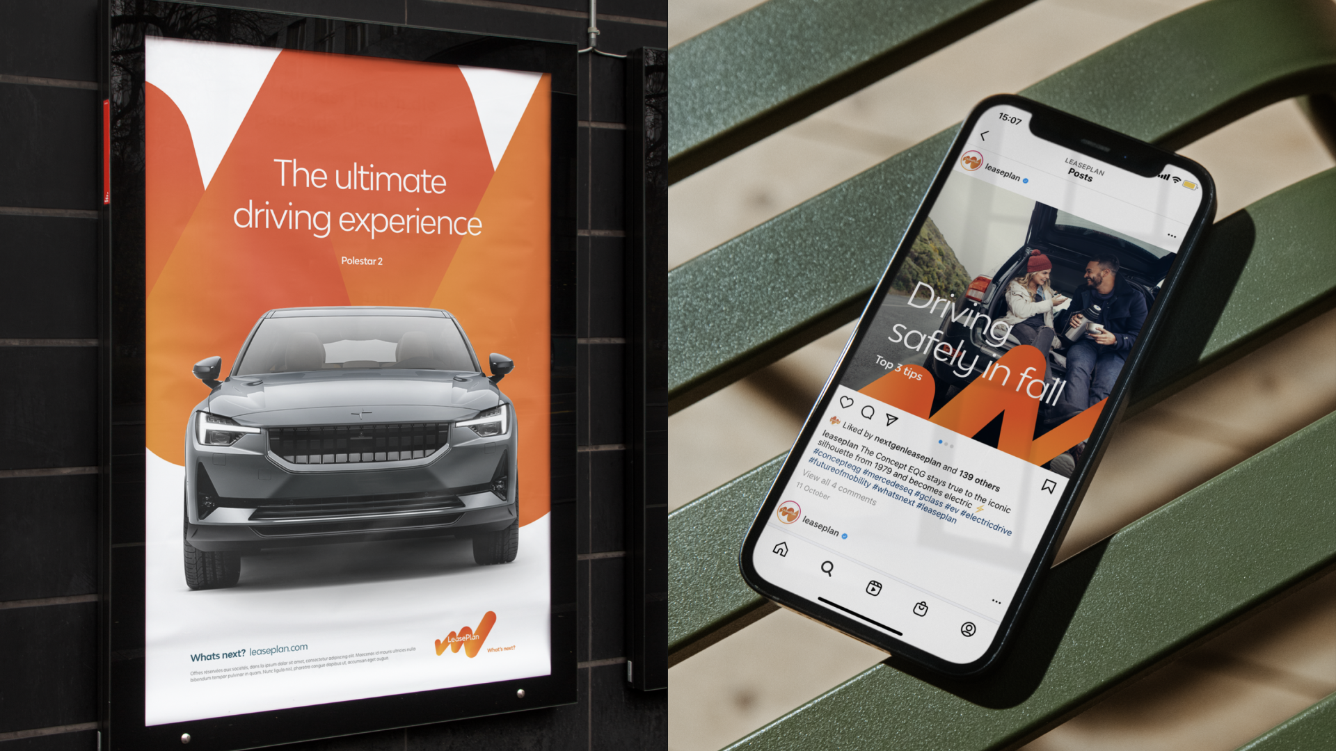
With approximately 1.8 million vehicles under management in 29 countries and accounting for future growth, the challenge was to refresh the global visual identity and realign it with the brand and business strategy. The goal was to establish a clear, consistent and recognizable brand identity that works for global, local, internal and external audiences.
DESIGN SOLUTION
Keeping in line with LeasePlan’s drive to sustainable mobility, we chose to realign and build on the strong foundations we already have in place. We cleared the road by reviewing the visual identity, changing the conventions of how assets are utilized, enriching the collection of brand assets, and evolving into a fully aligned visual identity.
To establish a new design language, we carefully deconstructed the existing brand and visual identity; analyzing which aspects work and which are still missing. This unveiled the conventions that needed to be adjusted to make the new identity work for all markets. We developed and enriched the current identity by reflecting the qualities of sophistication, confidence and friendliness.
DESIGN SYSTEM
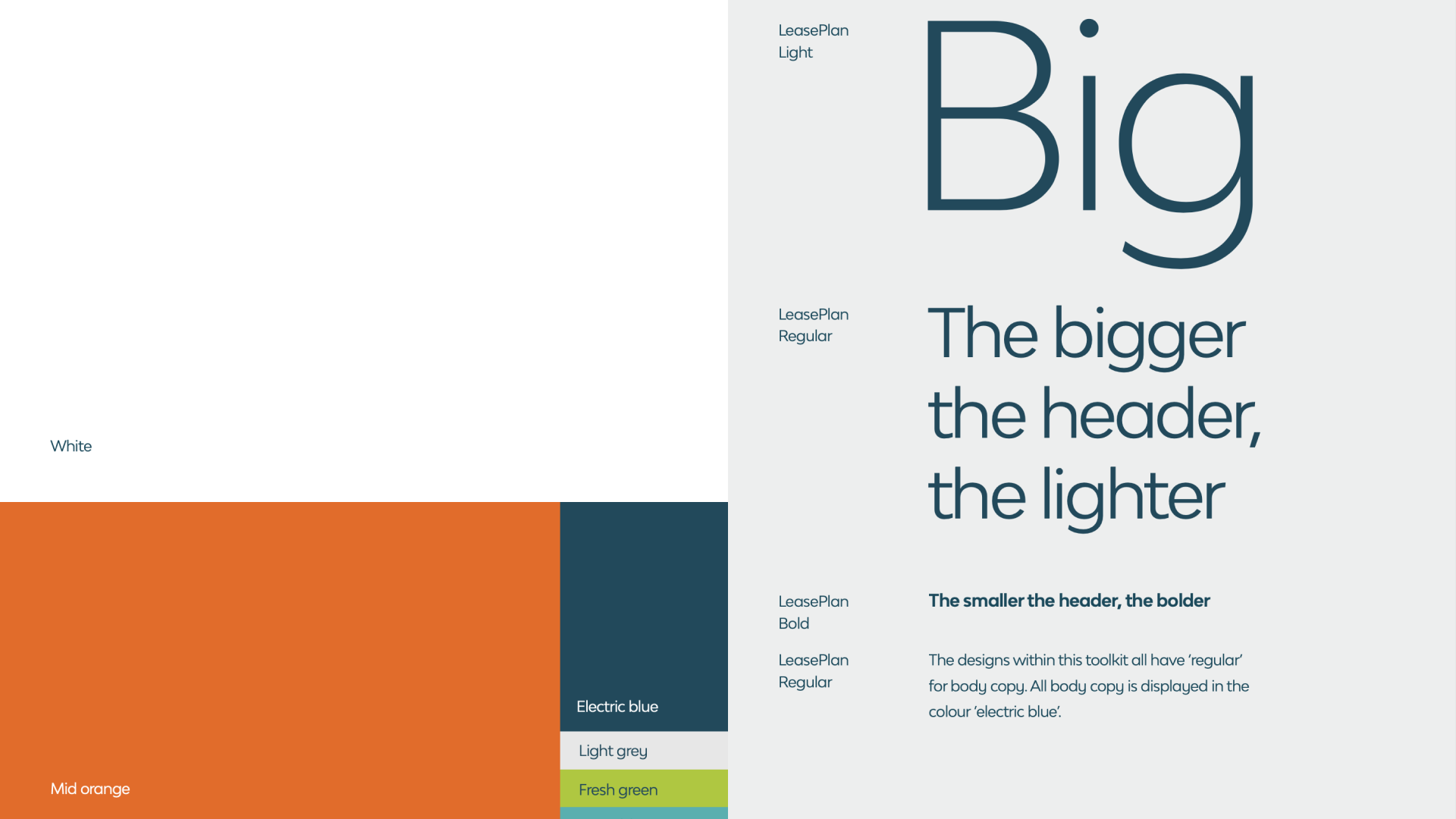
TYPOGRAPHY Although LeasePlan’s bold, chunky font was well-established and effective at inspiring action, we felt that it could do more to reflect the values of sophistication and friendliness. Guided by the principle of less is more, we decided to make space for a new practice: the bigger the header, the lighter the font, the smaller the header, the bolder the font.
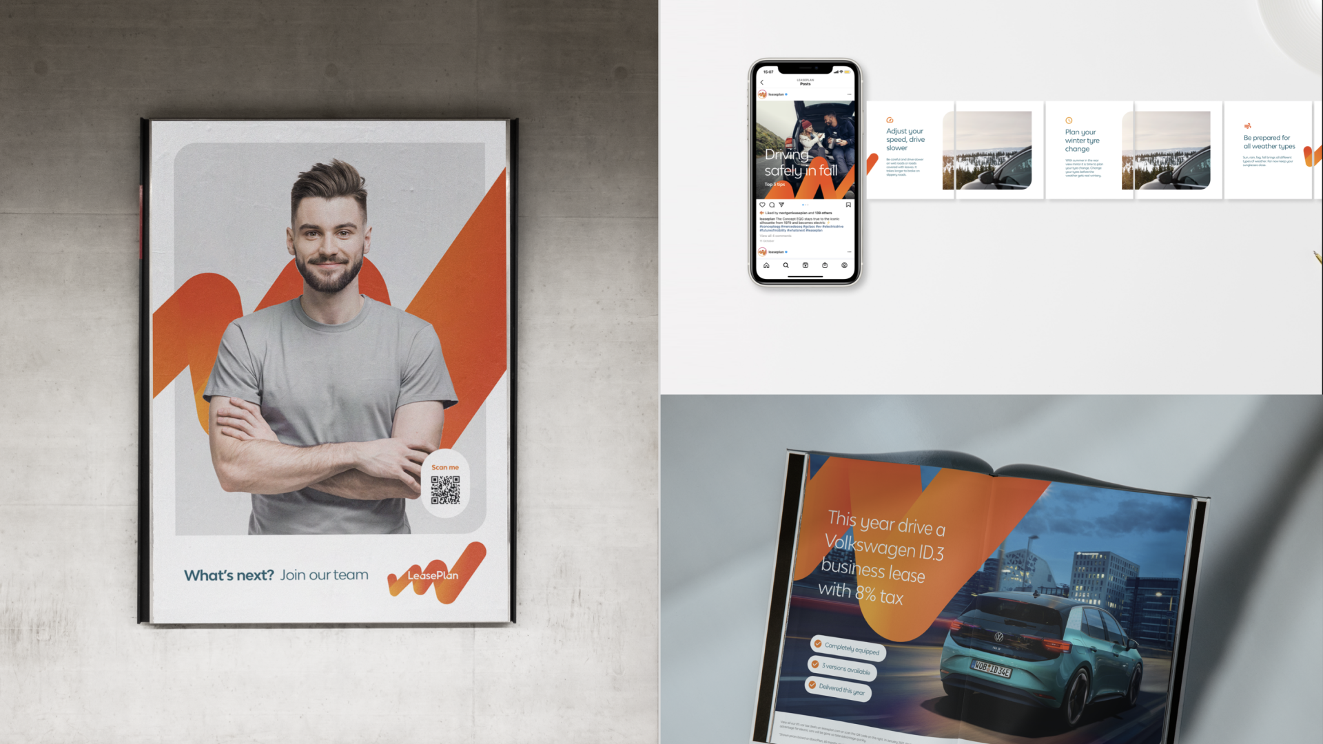
COLOURS LeasePlan’s rich color palette gives way to an abundance of design options. However, a plethora of color choices can lead to an imbalance and fragmented utilization in the various markets. We restored order and brought the brand back to its essence; with fewer colors and a simpler, cleaner palette. Orange as the foundation for friendliness, supported by the finesse of blues, greens and greys. After all, a sophisticated brand like LeasePlan shouldn’t have to scream to communicate effectively.
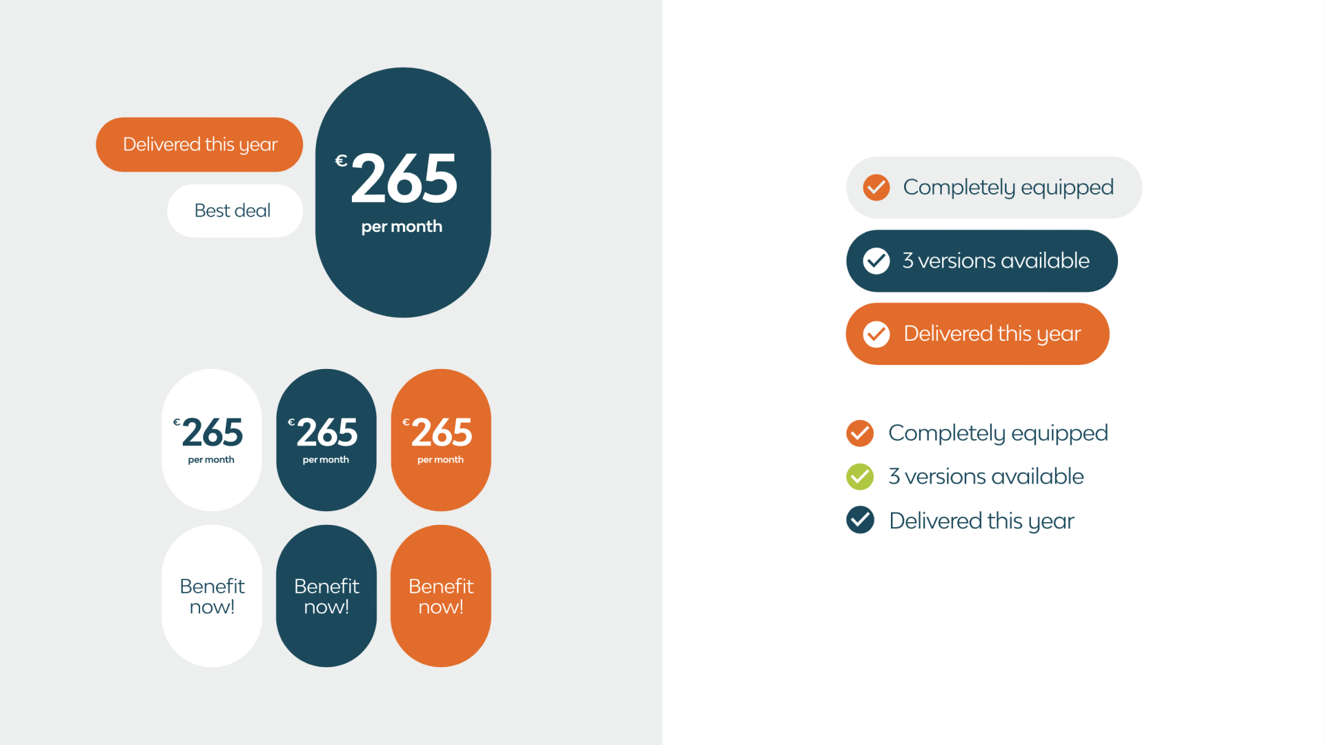
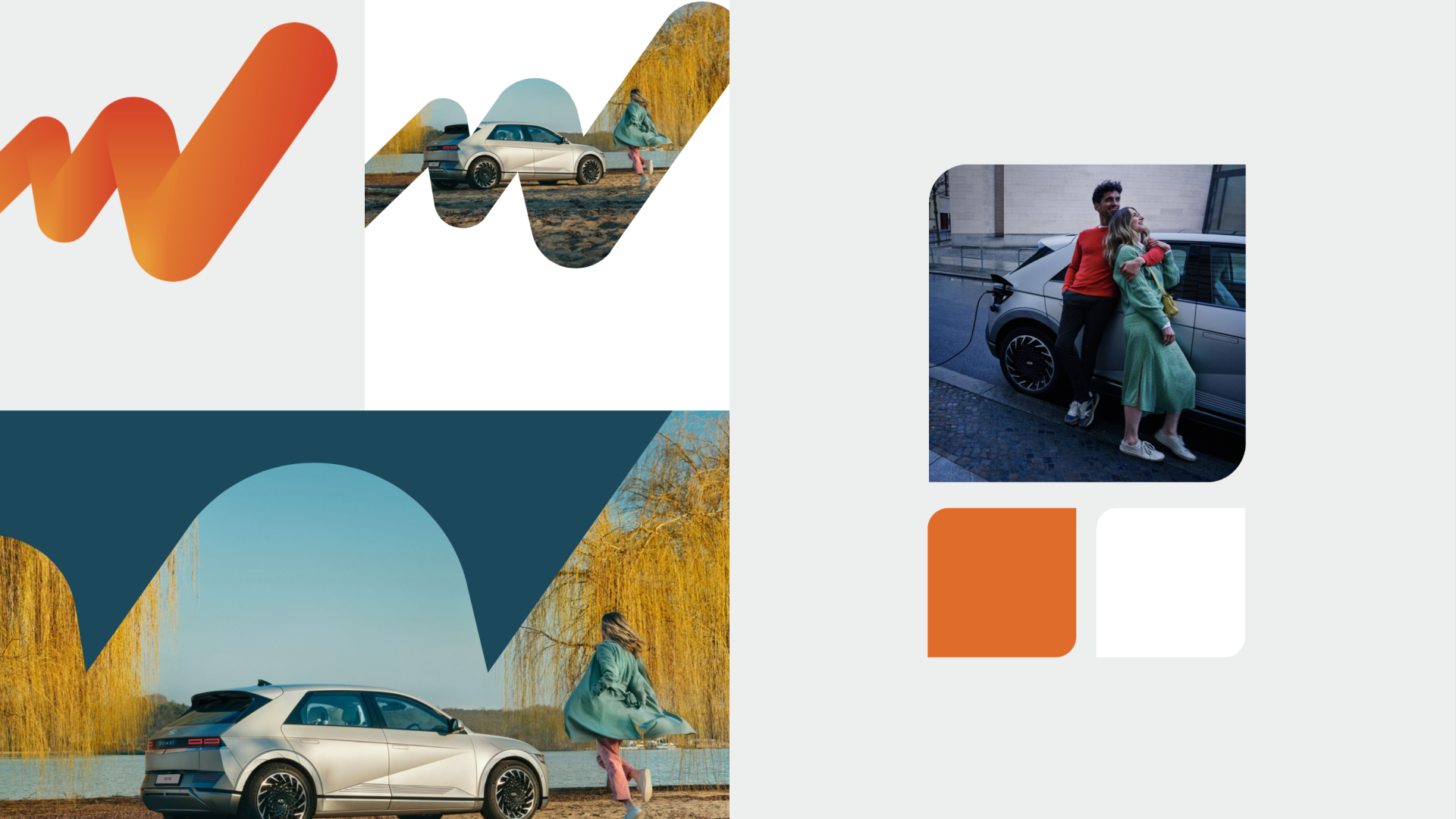
SHAPES We walked the line between old and new in our exploration of shapes. LeasePlan's ‘journey line’ is one of their most recognizable visual devices, but the conventions set for it limited its potential. We changed the conventions to maximize its power and added several more visual devices to further enrich our framework. With the addition of the rounded square and pill shape, we added elegance, friendliness and sophistication. This subtle transition refreshes designs yet maintains their attention-grabbing qualities and keeps them recognizable. It also helps LeasePlan’s employees to add text and create crystal clear call outs to photography.
DESIGN PROCESS
EXPLORATION Extensive sketching rounds of visual + experience directions
FINETUNING Collated best ideas and sorted into potential design directions
CONVERSATION Communicated closely with the client in workshops to present our ideas, collect feedback and align
PRESENTATION Collated design findings into toolkit for presentation to the broader markets
ONGOING OPTIMISATION Monitoring market use + analysing results

Selected works
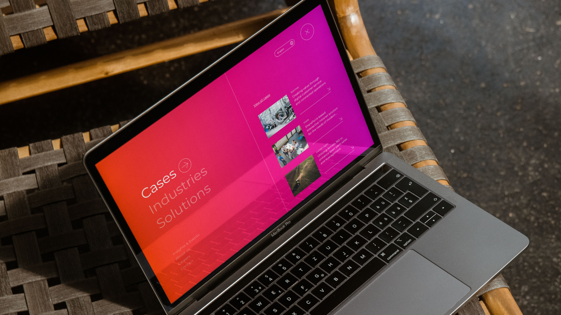
FellowmindDigital Experience, Branding & Campaign
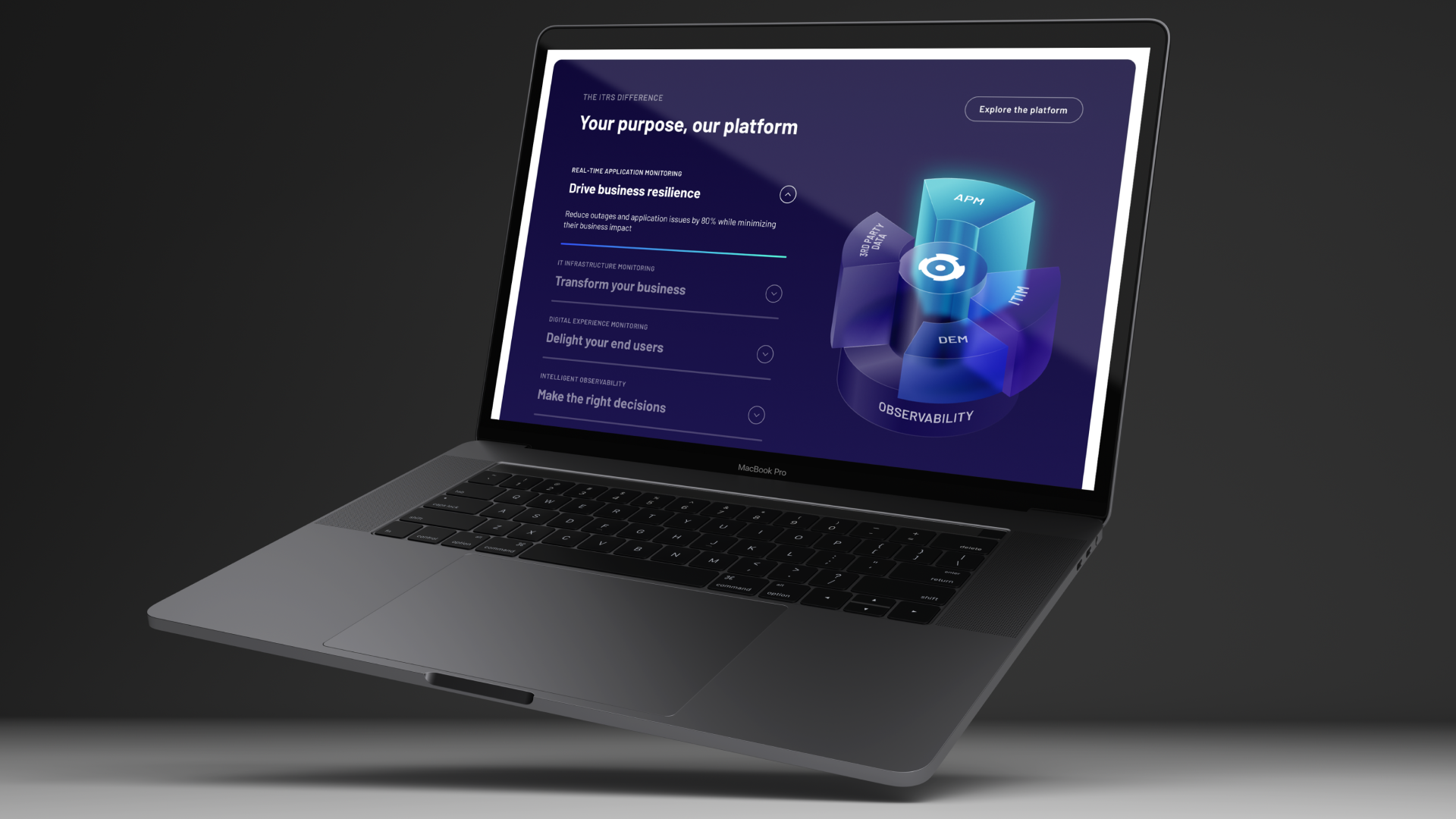
ITRSDigital Experience & Branding
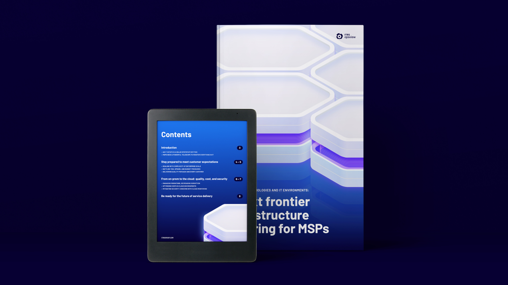
ITRS Opsview for MSPsDigital Campaign & Content
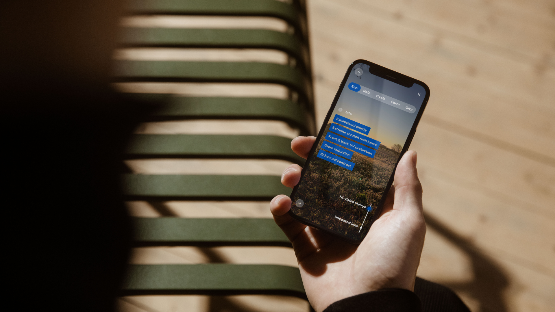
Hoya Hi-VisionDigital Experience & Campaign

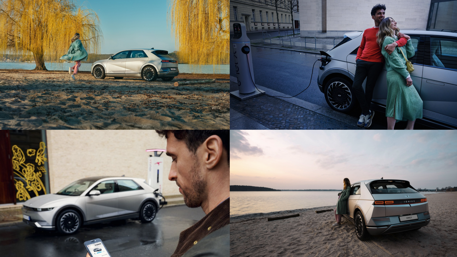
PhotographyLove Stories, People & Places